What color paint is that!? (And why it might look different in your house.)
If I made a tally list of every design question my clients and social media friends ask about, the number one thing would be PAINT COLORS!
I strive to be sure my images are as true to real life color as they can be. But, here’s why a color in my home may look different in yours (or your friend’s home):
The amount of natural light your home gets is different than mine.
The light bulbs you use may be a different color. Did you know there are cool or warm light bulbs?
Other items in your home are making a certain color look different. For example, the carpet or other wall colors around it may change the look slightly.
The sheen of paint may be different (matte, satin, eggshell, etc.)
The time of day a photo was taken makes a difference in what the paint color looks like on the wall.
Do you have texture on your walls? That will also change the look of the color.
And finally, the paint itself. Sometime it can be mixed at 50% or 75%, which simply means the color isn’t as strong.
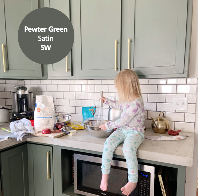
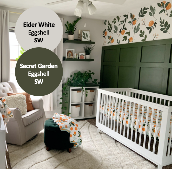
And now what you’ve been waiting for - the colors! You can PIN these images for later. :)
SW = Sherwin Williams
BM = Benjamin Moore


Don’t let choosing a paint color stress you out. There’s always more than one right answer. :)
From my studio to yours,
Courtney